Hello,
I saw this the other day and immediately knew how I wanted to style my website. It's a bit bold and I'm really not sure if it will pan out, but at the very least it should be unique. That is of course if I can execute it well.
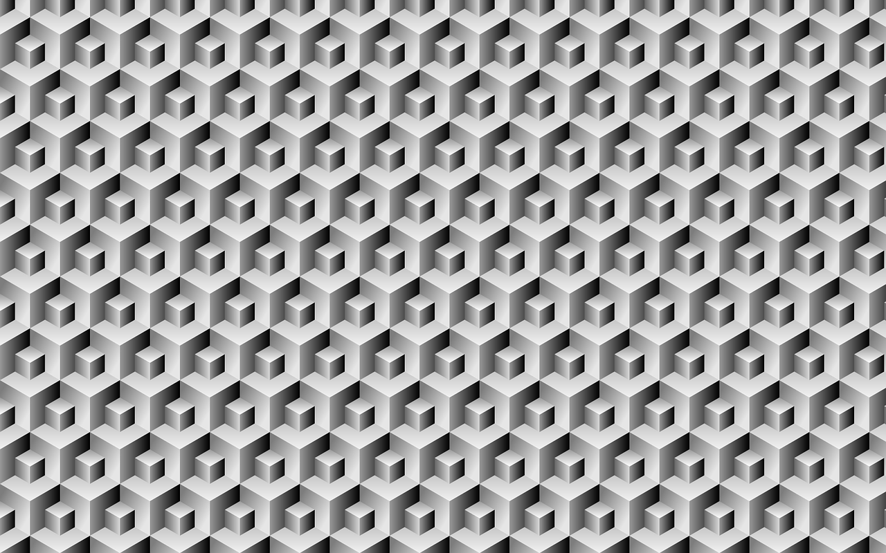
The Plan
A background of isometric shapes like in the photo, but less cluttered. Content integrated into the background that can be interacted with.
I think to do this well I need to find a good middle ground between how much should be isometric and how much should just be normal. In my mind everything can just be isometric but I think in execution I'll have to compromise a bit. Regardless, I wanted to focus today's blog on the struggles I've been facing when making this unique shape.
Isometry 101...ish
This is by no means a lesson on isometry but here are my insights on this awesome geometric concept. For starters, it's a neat way to simulate depth in a 2D space. It's often used in video games like the famed Roller Coaster Tycoon. It simulates a kind-of top-down perspective, like looking at a cube from the top corner.
I won't pretend to understand the math behind creating an isometric shape but I'll illustrate how to create a basic cube in CSS.
You start by creating the cube element with three children:
<div class="cube">
  <div class="face top"></div>
  <div class="face left"></div>
  <div class="face right"></div>
</div>
First, style the wrapper cube (I'll omit the centering CSS):
.cube {
  position: absolute;
  width: 300px;
  height: 300px;
}
Transform-origin is used to make sure all the faces have a common starting point:
.face {
  position: absolute;
  width: 100px;
  height: 100px;
  transform-origin: 0 0;
}
Now, the actual skewing and rotating:
.right {
  background: red;
  transform: rotate(-30deg) skewX(-30deg) scaleY(0.864);
  /*
    Rotate: 30 degrees counter-clockwise turn around it's center
    SkewX: Slant element horizontally
    ScaleY: Vertical squish of 0.864 which aproximates cos(30deg) to get the approximate height for an isometric view
  */
}
The left side is the same; just swap the rotate(-30deg) for rotate(90deg). The top, however, is a bit more unique.
.top {
  background: green;
  transform: rotate(210deg) skew(-30deg) scaleY(0.864);
}
All together:
.face {
  position: absolute;
  width: 100px;
  height: 100px;
  transform-origin: 0 0;
}

.right {
  background: red;
  transform: rotate(-30deg) skewX(-30deg) scaleY(0.864);
}

.left {
  background: blue;
  transform: rotate(90deg) skewX(-30deg) scaleY(0.864);
}

.top {
  background: green;
  transform: rotate(210deg) skew(-30deg) scaleY(0.864);
}
At the end of the day, you're creating three parallelograms and just using the transform style to change the point from which skewing and rotating happens. At the moment, this is how I'm achieving this look but I'm certain there are better ways of doing this.
My next challenge will be figuring out how to turn this into a repeating pattern to cover the background of my page. At the very least, I will end my day with a cool-lookin cube. With that, I thank you for reading today's blog. See ya tomorrow.